Glassmorphfolio
There is a never-ending relationship between me and a portfolio. When I was searching for which major I should continue into, I avoid FSRD ITB because I just don’t want to create an art portfolio.
Two years later, in 2022, I create my first own portfolio.
Keep in the note, that I do love design very much. Since little I like to draw and paint and color, or just a simple sketch on my school textbooks. But, it was just based on my imagination when I drew.
Back in the portfolio making, I was confused about which style I had to choose to be applied to my portfolio. At first, because I like minimalism (and still trying to live in that way), I want to do a black-n-white design. But, it will fail right away when I input some of my designs. So I tried to research which design style I will use.
One day in my Object Oriented Programming class, when class participants make presentations about design patterns, I found a presentation theme that caught my attention. My friend beside me said that it is Glassmorphism, one of the trending designs for websites. It still contains minimalism, but with 3D effects. The basic things of this style are :
- It uses transparent elements (objects such as glass that make the background look blurry).
- Floating object effect.
- Use bright colors to highlight the transparency of objects.
- Thin object borders to add a glass-like effect.
Glassmorphism UI design means transparency with a glass blur effect thanks to the use of background blur. Also, what makes Glassmorphism even more popular among designers is its layered approach with floating objects, the use of bright colors that accentuate blurry transparencies, and smooth, thin borders on translucent objects.
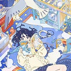
Here is one page of my portfolio that uses Glassmorphism as its theme style, I make every page using Figma.

Oh, I almost forgot. Besides Glassmorphism, I also use gradient style for the background. I know it become so far away from the first style that I’d like to. The background plays an important role in making this effect shine. Don’t make it too simple or boring if you want to make the effect look perfect. In addition, you also can’t make it in too deep detail.
I add background blur effects and drop shadow for the transparent box, and the fill is white with 30% opacity for the front box, and 25% for the behind. The closer an object is to the background, the lower the blur level (the more transparent it is). The farther an object is from the background, the higher the blur level (less transparent). Try making a thin border on the edge of your element (but I don’t apply it to the design though). This can emphasize the different visual hierarchies.
I blurred the objects so it won’t distract the attention from the content and simply just adorn the design.


For full version of my portfolio, please visit my Behance.
What do you think about the choice of style in my portfolio? Feel free to contact me for criticism and suggestions based on my design.